Microsoft’s New Logo
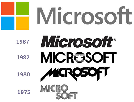
The new logo is the first to feature a separate icon and color. The colors match those applied to the symbols for Windows 8 (the neutral light blue), Office (the active orangery-red) and Xbox (the relaxed light green). That leaves a mysterious yellow. (Maybe for Windows Phone and Surface tablets?)
On the plus side:
- it’s a clearer more modern design
- it’s simple; logos should always be simple
- it matches Microsoft’s more-focused consumer product line
- it embodies the friendlier, cuddlier image the company is working hard to portray
On the negative side:
- does it reflect serious business software required by corporate users?
- why doesn’t it apply 3D depth effects used on the other logos?
- will it work in gray-scale?
- is it distinctive enough?
- does it look too much like the old Windows logo?

